

Unlocking the Power of Color: How Psychology Shapes Website Design
In a digital world where first impressions are formed in mere seconds, the colors we choose for our websites are more than just aesthetic choices; they wield a considerable influence over how visitors perceive brands and navigate their experiences. Imagine strolling through a vibrant marketplace—each hue carefully selected to evoke emotions, spark interest, and beckon you closer. Just like the art of physical spaces, color psychology plays a pivotal role in crafting an inviting digital landscape. Join us on a colorful journey as we explore the fascinating interplay between color and website design, revealing how subtle shades and striking palettes can not only captivate attention but also drive action. Whether you’re a seasoned designer or just dipping your toes into the creative waters, understanding the impact of color can empower you to create websites that not only look stunning but resonate deeply with your audience. Let’s dive in and discover the language of color together!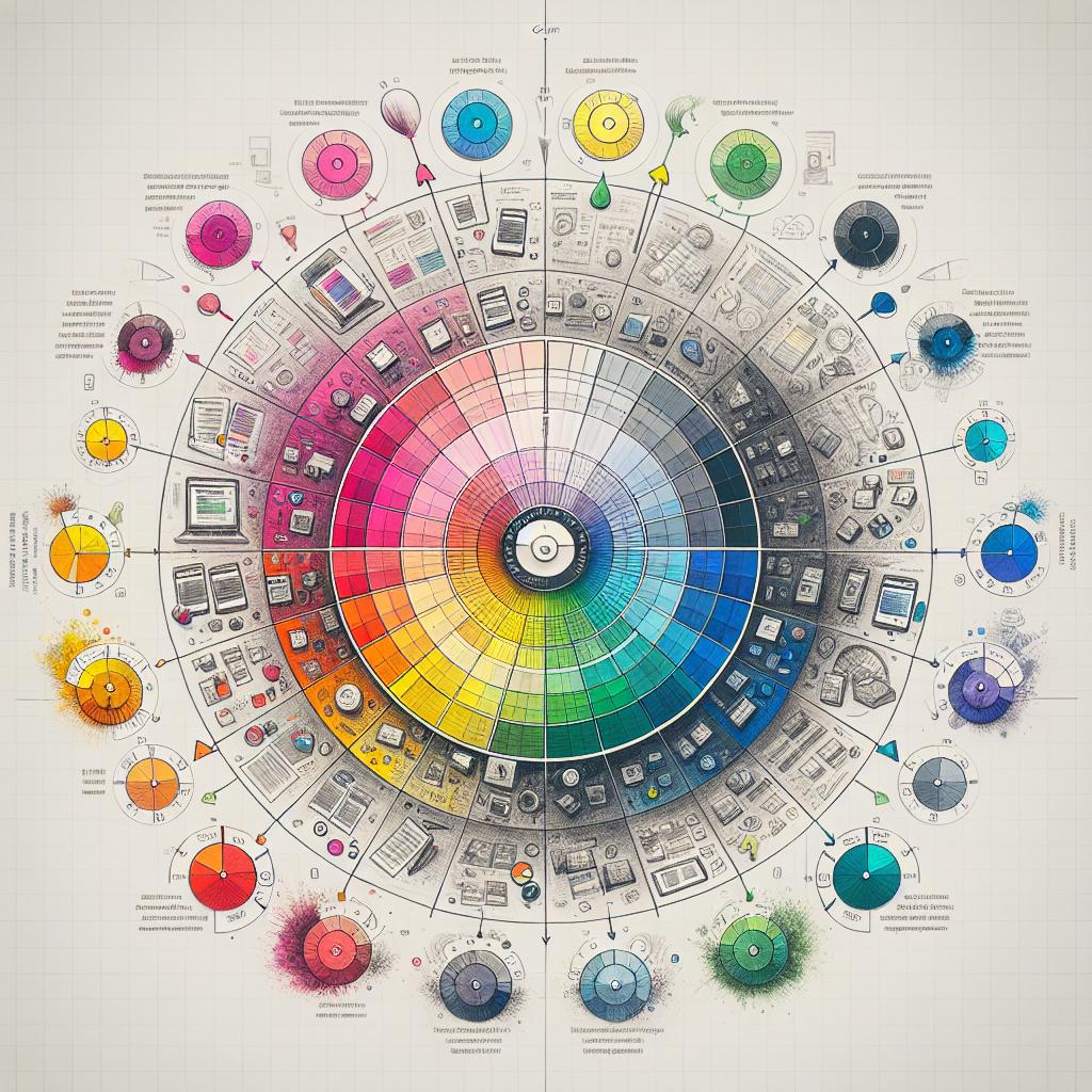
Understanding Color Psychology and Its Role in User Experience
Colors are more than just aesthetic choices; they evoke emotions and influence behaviors. For instance, blue is associated with trust and dependability, making it a popular choice for financial institutions. Conversely, red can stimulate excitement or urgency, often seen in clearance sales and fast-food branding. Understanding these associations is crucial for designers aiming to create compelling websites that resonate with their target audience. By strategically selecting hues, websites can foster positive feelings, enhance user engagement, and guide visitors toward taking desired actions.
Utilizing color effectively can lead to a more cohesive and memorable user experience. This can be achieved by adhering to well-established color principles, such as complementary colors that create visual balance or monochromatic schemes that evoke serenity. Below is a simple table that highlights various colors and their psychological effects:
| Color | Psychological Effect |
|---|---|
| Blue | Trust, calmness |
| Red | Excitement, urgency |
| Green | Growth, balance |
| Yellow | Happiness, optimism |
| Purple | Luxury, creativity |
Ultimately, the thoughtful integration of color can not only improve the aesthetic appeal of a website but also empower it with functionality, carefully guiding users through their journey. By harnessing the power of color psychology, designers can create environments where users feel comfortable, energized, or inspired—transforming casual browsers into loyal customers.
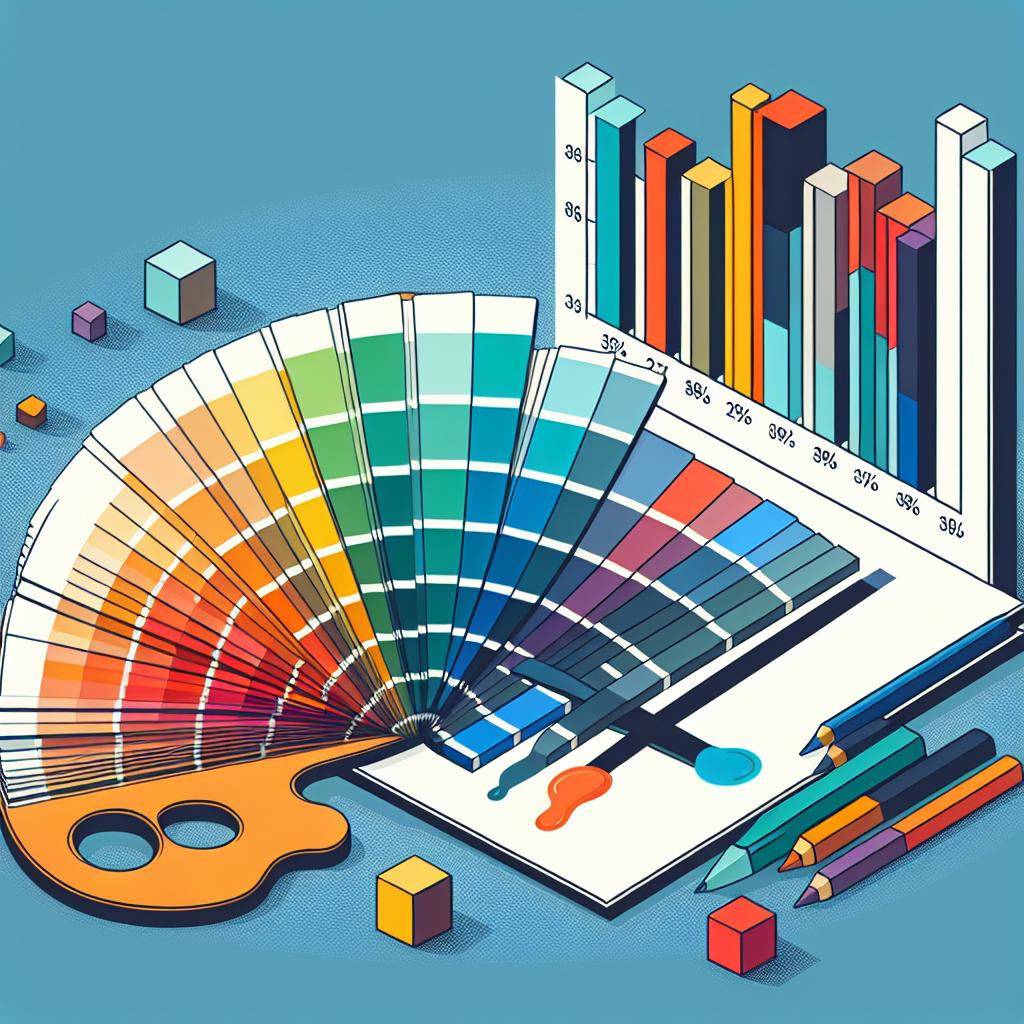
Choosing the Right Palette: Colors that Convert
When it comes to selecting colors for your website, understanding the psychological impact of different hues is essential. Colors evoke emotions and can significantly influence user behavior, leading to higher conversion rates. Here are some categories to consider when crafting your site’s color palette:
- Red: Conveys excitement and urgency, often used for call-to-action buttons.
- Blue: Associated with trust and dependability, making it ideal for financial or corporate sites.
- Green: Represents growth and harmony, frequently utilized in health and eco-friendly brands.
- Yellow: Evokes feelings of optimism and energy but should be used sparingly to avoid overwhelming users.
- Purple: Suggests luxury and creativity, perfect for artistic and premium brand expressions.
The harmony among colors is equally vital. A well-balanced palette not only enhances aesthetics but can also guide user attention and interaction. Consider employing the following tips for an effective layout:
| Color Scheme | Effect |
|---|---|
| Monochromatic | Creates a sophisticated, minimalistic look. |
| Analogous | Provides a calming, cohesive appearance. |
| Complementary | Generates contrast, ideal for drawing attention. |
By thoughtfully choosing and harmonizing your colors, you not only create an inviting atmosphere but also pave the way for higher engagement and conversions. Remember, the right shades can transform a simple website into a dynamic experience!
The Emotional Language of Colors and Brand Identity
Colors are more than mere visuals; they are a universal language that transcends words, evoking emotions and setting moods. When incorporated into website design, color psychology plays a pivotal role in shaping brand identity. For example, a soft blue can imbue a sense of calm and trustworthiness, making it ideal for financial or health-related websites. On the other hand, a vibrant red can ignite passion and urgency—perfect for sales pages or platforms aiming to elicit a quick response. Each hue carries its own set of psychological associations, influencing how users perceive a brand and their overall online experience.
Understanding the emotional resonance of colors allows designers to craft a more cohesive brand identity. Consider how different industries can leverage color to evoke specific feelings in their audiences:
| Industry | Color Choice | Emotional Response |
|---|---|---|
| Finance | Blue | Trust & Reliability |
| Healthcare | Green | Calmness & Healing |
| Food & Beverage | Orange | Enthusiasm & Energy |
| E-commerce | Red | Urgency & Excitement |
Utilizing consistent color schemes aligned with specific emotional triggers, brands can strengthen their identity and foster deeper connections with their audiences. Colors should not just be aesthetically pleasing; they must also tell a story—one that resonates with the target demographic and encapsulates the very essence of the brand’s values and mission.
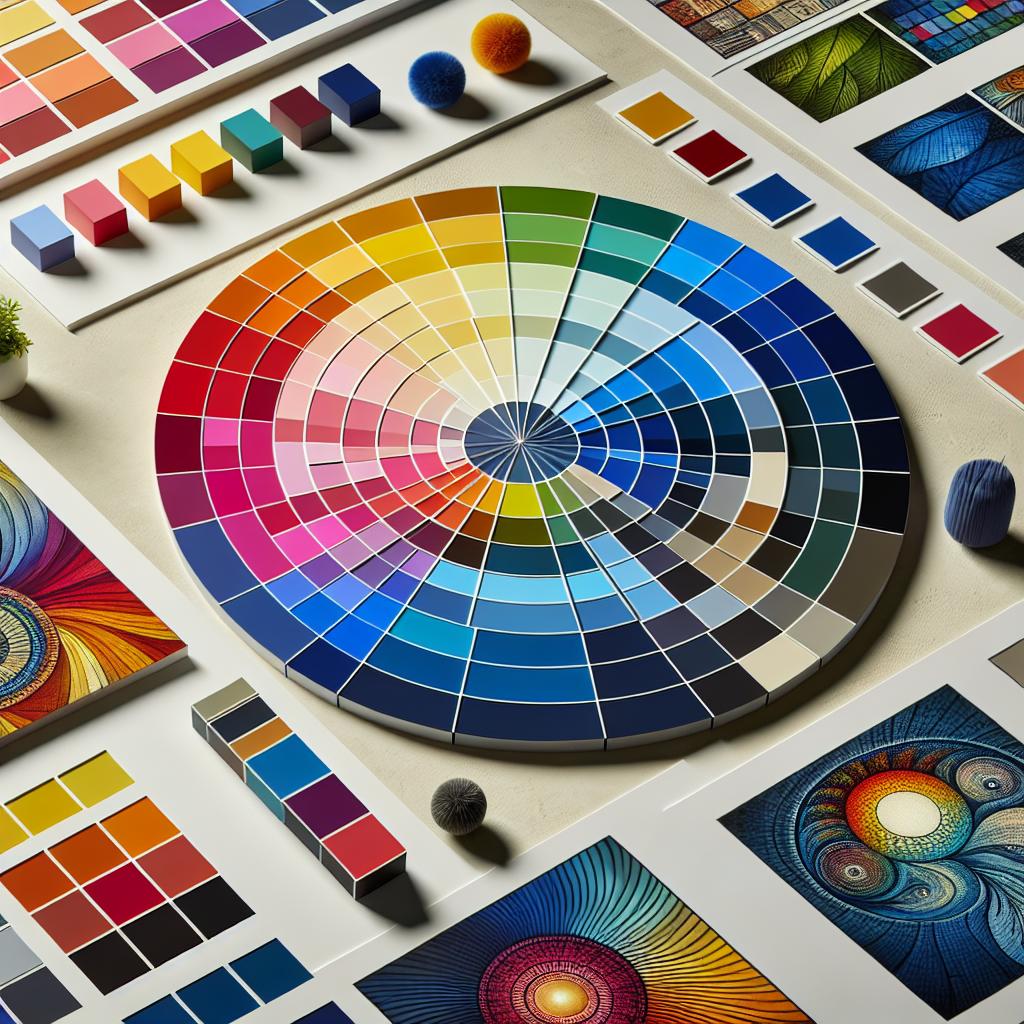
Creating Harmony: Balancing Color Schemes for Effective Design
“`html
When it comes to web design, the interplay of colors can significantly enhance user experience. To create a harmonious environment, consider adopting a color wheel approach, where complementary shades dance together, drawing the eye without overwhelming it. Developing a balance can be achieved by focusing on the psychology behind colors; for instance:
- Blue: Instills trust and calmness.
- Green: Evokes growth and health.
- Red: Creates urgency and excitement.
- Yellow: Invokes optimism and clarity.
Additionally, employing a systematic scheme—such as the 60-30-10 rule—can guide your color distribution, whereby 60% is the primary color, 30% is the secondary, and 10% is an accent. This technique helps to ensure clarity and unity across your design. Consider the following table for a quick reference on common color combinations:
| Primary Color | Secondary Color | Accent Color |
|---|---|---|
| Blue | Light Gray | Orange |
| Green | Dark Brown | Gold |
| Red | White | Black |
| Yellow | Blue | Dark Gray |
“`
In Retrospect
As we wrap up our colorful exploration of how color psychology shapes website design, it’s clear that hues hold incredible power beyond mere aesthetics. They can evoke emotions, guide actions, and ultimately create a lasting connection between brands and their audiences. So, the next time you’re choosing a palette for your online venture, remember that every shade tells a story and every tone can influence a visitor’s journey. Embrace your inner artist, experiment with colors, and let your website reflect not just what you do, but how you want your users to feel. After all, in the vibrant world of design, every click could be a brushstroke in the masterpiece that is your online presence. Happy designing!